

Recent Posts
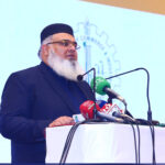
- APPRECIATION FOR YOUR ATTENDANCE AT THE ROUND TABLE CONFERENCE ITDC AT UNIVERSITY OF LAHORE
 March 13, 2024
 - CONSTRUCTIVE DISCUSSION: EXPLORING BUSINESS AND ECOMMERCE OPPORTUNITIES FOR PAKISTANIS IN RIYADH, SAUDI ARABIA
 March 8, 2024
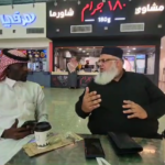
 - MR. ABDUL WAHAB AHMAD, LAHORE CHAMBER OF COMMERCE AND INDUSTRY'S STANDING COMMITTEE CONVENER, PARTICIPATES IN LEAP & DEEP FEST IN SAUDI ARABIA
 March 6, 2024
-